Important tip if you use image backgrounds on your website
We all agree that having someone wait 10, 20, 30 seconds for a website to load if that can be easily avoided is a bad idea, right?
Yet if you are using a big graphic as your backround, it might be what's happening: Depending on the background colour, the text may be unreadable while the background graphic is loading. The solution is to define both a background image, and a background colour that is similar to the colour of the image.
I've made a quick mock-up to demonstrate the effect.
 |
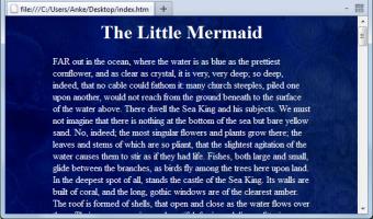
This is what the website's supposed to look like - dark, textured background, white text. (If that's a good idea is another question entirely.) The style definition is
body {
  background-image:url('background.jpg');
  color:white;
}
|
 |
This is what people see while the background image is loading, worst case. Possibly they changed their colour scheme so the default background is not white, but white is pretty popular. The text is there, and visible if highlighted, but it doesn't really look that way. |
 |
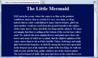
And here's what the website looks like while the image is loading with a background colour defined, too.
body {
  background: #010D55 url('background.jpg');
  color:white;
}
I got the colour by running a Gauss blur with a very high radius over the image and using the eyedropper tool on the result, but eyeballing it works fine, too. |
The same principle applies if you are using a dark background for the website and a div or similar with a light coloured background image (which then has a text colour similar to the background): Give the div a light background colour.
I hope this helps someone out there.


